


Wednesday, 11 November 2009

Sunday, 1 November 2009

This is another advert which i have researched and that has continous coventions that other HMV adverts have. The qualties that they have in comon are
-Three colour system
-Usage of symbols and slogans
-Variation in text size and colour
-Contrasting colour
-Contrasting colour
-A selection of images ( i have used this convention in my poster)
- To make it seem more realistic and to abide by copyright issues i have included small print at the bottom of the advert
Sunday, 25 October 2009


In order to produce a realistic product that could be sold in our competative market, i had to research other products that are already in the exsisting market so i knew what i had to compete against. Not only for that reason i wanted to look at the different conventions that are used and then apply them to my product. As we can see the front cover is very important as it creates a visual image to the audience before the even listen to the music. It is known that the first impression is the most important so in order i have to gain and intreage my audience. Just by looking at the examples that i have given i can see that they try to get across feeling are a mood to its audience.
-In the Theory Of A Deadman front cover (car one) i can judge by looking at it that its going to be fast pased and very upbeat. This is due to the car and the baby blue colours of the sky. In contrast is the grill of the car which gives the impression more of an edge which gives the implications that it might have more of an agressive tone.
-In the other Theory Of A Deadman front cover i get the feeling that its going to be more down beat and the subject of the music isnt going to be on plesant matters. The man is dressed in black which has the conotations of death which is also enhanced by the fact that he has angle wings. This then gives the impression that its about death in some form or way. The surroundings also look quite barron and dead. The cover has a 'weston' feel to it which is due to the text which has been used and also the location. What also gives the sense that this product is real is the fact that it has the parental guidance symbol on it. I have included this on my own work to give it a more realistic tone.
The reason why i have chosen the Linkin Park album cover is to show the effect of the black and white convetion as a real product. I have used this convention within my own work as it fits in well with the story line and creates i gloomy feel which is what i wanted to achive. The reason for this is beacause the relation ship between warren and sorrel is going 'sour/dead' so i wanted to have a bland, dry effect to help put this across.
Saturday, 24 October 2009
During the process of 
-Three colour system
-Various symbols so that the reader can relate the poster to what company it belongs too
-different sized text which symbolised different importances as big text is used to attract the audience to a particular part of the poster and the smaller text is for more detailed information.
-They use slogans to catch the audiences attention and so that they can remeber in the future.
-There is a dramatic picture in the background which also gains readers especially if its a well known musician. The fact that they used a black and white picture's makes the HMV logo stand out lots.
Friday, 23 October 2009


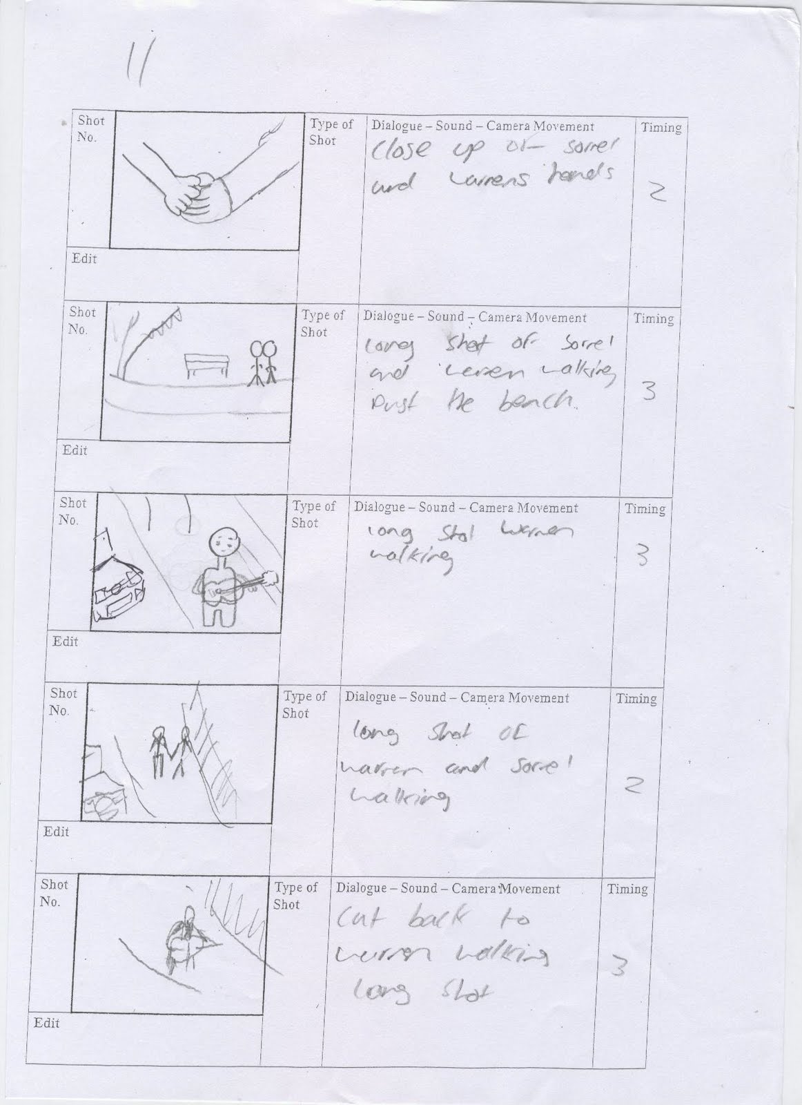


Me and ian decided to take the pictures when we visited
south shields again. The reason why we took these pictures it show the reason why we chose this location. As you can see it looks very open and a place where you could drift off in your own thoughts. This then reflects the main characters feelings at a certain point as he is rethinking what he's done.
different angles


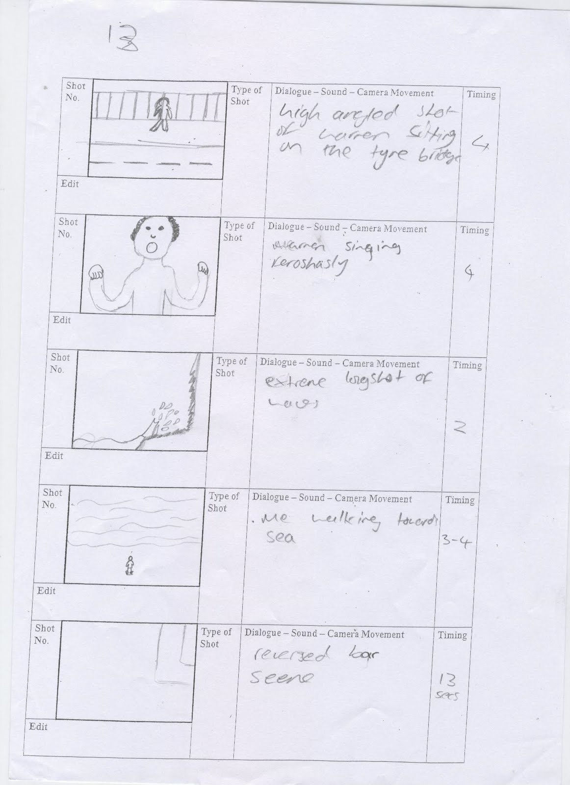
When going loaction scouting we decided to try out various angles to see if the location was appropriate.  we ended up keeping this location and using it in out video. in this particular scene we wanted him to look week so we used a high angled camera to look down on him so he looks less dominant in the picture.

 we ended up keeping this location and using it in out video. in this particular scene we wanted him to look week so we used a high angled camera to look down on him so he looks less dominant in the picture.
Thursday, 22 October 2009

Next to the cliff edges there is a huge bolder which is accesable. i though this would be an effective place to film as it had the vission of the sea behind me when singing with the guitar. this could be a metaphore to show that the character is lost in the wilderness as the character would be dying.
Wednesday, 21 October 2009
music video analysis
when analysing music videos of the rock genre i have noticed several conventions throughout. The following conventions are consistant throughout my research :
* a story line which usually is about the main character
* live performances
* editing which is corospondant with the pace of the music
* clothing is a simular style in most videos ie jeans and Tshirt
* todorov narative structure theory usually applys to most
* often about the subject of relationships
* use of materialistic properties such as expensive cars and luxurous houses
* they try to make the story as realistic as posible becuase they want to relate to the audience
* lip synchronising
* Various camera angles and shots used
now that i have noticed these conventions and it is proven that they work well, i am going to incorperate them into our video production.

Tuesday, 20 October 2009
loaction scouting 2


When searching for locations to shoot at we considered this location. We wanted abstract and unseen loactions in our music video to make it more unique. We thought that places like these would be better than just a conventional stage.

When looking for locations too shoot are music video i thought it would have been a good idea to include this one. The main theme of are or story is about a man who is dying and the video goes through different stages of his life. This could be the scene where it has him walking away with his guitar in his hand as if he is walking away or towards the camera most liking in an establishing shot or a long shot.
Monday, 19 October 2009
Lyrics for Theory of a deadmans song In the middle
what would you do if we woke up and the whole world was gone?
well would you belive with me is where u belong?
well there goes the world and where right in the middle
there goes the world and where right in the middle
i said leave me here
i said leave me here with you
as the city crumbles i see that theres nothing left behind
as we lay here together i feel your heart beat with mine
with time standing still, here is where we've always been
well there goes the world and we're right in the middle again
i said leave me here
i said leave me here
i said leave me here
i said leave me here with you
hey you, where are we going from here?
hey you, where are we going from here?
hey you, were are we going?
cuz there goes the world and I'm right in the middle with you
im right in the middle with you
im right in the middle with you
im right in the middle with you
im right in the middle with you
Sunday, 18 October 2009

Saturday, 17 October 2009


Friday, 16 October 2009
questionaire for music video
(1) what type(s) of music videos do you like?
RnB
classic
rock
jazz
punk
blues
pop
dance
country
(2) Out of the following artists who do you like best?
theory of a deadman
shakira
girls aloud
bass hunter
rev theory
nickleback
surgerbabes
the saterdays
JLS
(3) Out of the following songs, which do you prefer?
In the middle-Theory of a deadman
How you remind me-Nickleback
Wordshaker-The saterdays
The one-shakira
(4) Do you prefer to see animations in music videos?
yes/no
(5) In your opinion, what is the most important feature of a music video?
The narative
The shots
The music
The pace
Lip synchronisation
(6) What type of shots/camera movements/camera angles do you like to see in a music video?
Fast paced, action shots
Slow paced shots
close ups
long shots
mid shots
panning
zooms
high angle
isolation shots
low angle
(7) do you like to see music videos that follow the same conventions?
yes/no
(8) where do u watch music videos?
tv
internet
Thursday, 15 October 2009
In our group there is me, Jonny Elliot, Ian Shannon and Christina Halmer. Out of the choices we had we decided to go along with creating a music video. We will be creating a rock music video. We have assigned each other certain roles in the production of our project as we are stronger in different aspects of the course. Firstly I chose to do the artistic side of the project which includes making the story board, finding and choosing the locations for the shoots also the general planning which looks at the conventions of music videos and how to include them in ours. Jonny will be concentrating on the Photoshop aspects of the project as he has had lots of experience with it and uses it in a creative way. Ian will be focussed on the shooting of the actual video. This will be focusing on the camera angles and the way its shot. The reason being is that he would like to peruse this as a career and would find it useful to gain more knowledge in this aspect of media. On the other hand Christina will focus on the editing of the video which will be looking at sound and weather the shot is decent are not.
During the course of last year I have adopted various skills and knowledge, not just in practical production but in the conventions of the chosen area we decided to investigate in. when looking back on my practical production work I can clearly see the use of conventions I have used. To make it successful. For example I have used a continuous colour scheme, a large mast head, big text and a range of pictures to draw the audience in. On the other hand I have adopted a variety of other skills like becoming competent with Photoshop and recognising good pictures from photo shoots that would fit the criteria we where aiming for. Apart from the practical production side of the course I have also progressed in other skills such as time keeping team building and being critical about my own work. Last year are Blog wasn’t multi media which in some ways restricted the ways we could express the progression of are work. With us having a multimedia Blog we could have been able to post videos of ourselves explaining the current position of our project. Therefore realising from this we decided to include multimedia sources in our Blog this year as we see it could be useful to us.
Monday, 11 May 2009
AS Practical production
In what way does your media product use, develop or challenge forms and conventions of real media products?
When looking at various media products that are out on the shelves of our local newsagents I came to think about how my magazine could challenge them. I have used limited number of fonts and colours through out the magazine including on the front cover. This convention is used to keep it simple therefore means there will be less chance of confusing the reader. I have also used the convention to keep the text placed on the left or right hand side of the front cover. My text scrolls down the right hand side.

With the main goal of the magazine is to draw the reader in to read on and to buy the magazine they need to be vaguely informed of what the magazine will consist of. This is were use of eye catching text and pictures come in which play an important role in this technique. In some cases pictures are more useful than text as if the reader was in the scenario of seeing the magazine in a shop window they would not have enough time to read the head line. Therefore if they glanced at the picture it will take half the time to receive an assumption and therefore will be more likely to go into the shop to purchase the magazine. This is the reason for me having a big picture with the use of numerous pictures surrounding it on the front cover.
Firstly other media products such as Kerrang’s front covers usually consist of lots of pictures, big bold writing, use of three to four colours, big title and slang so the magazine can relate with the reader and the social group that it is aimed at. My magazine has used similar conventions as it is aimed at the same social group. The reason why I chose similar conventions to my opponents in the media world is that they sell well and the techniques are useful in receiving the readers attention. Some of these techniques are using vibrant colours on important words, having a big masthead and the use of lots of pictures then means there is more information to catch the readers eye. I also used the convention of free give away. The reason behind this is to help persuade the reader to buy this issue as they could be in with a chance of winning an ipod touch. The reader also gets a free poster with each issue witch is similar to KERRANG.
How does your media product represent particular social groups?
The approach to the social group that my magazine aims at is usually young men rockers of any race around the age group of 15-25 years of age. Also because of the age that its aimed at then means they could find it hard to purchase as there income will not be that great. With the magazines price being at £1.50 this then means its quite cheap therefore people from a various financial background will be able to purchase the magazine. Also with it being a weekly magazine I thought it would be a good idea to have the price cheap as the magazine wouldn’t sell if it was £5.00 per week. How I came to the conclusion to have it as a weekly magazine is that It was proven to be what the public wanted in my survey. Also knowing the latest weekly news about the readers favourite bands means that they can have sociable conversations at school about the content of the magazine etc. Weekly magazines are sometimes better than monthly for the quickness of the information which is better in some cases. For instance the reader might want information on the upcoming gigs. With a monthly magazine this then means the reader will have to wait longer period of time for the information unlike weekly issues.
The star of the magazine fits in well with the genre of magazine as the star is holding a guitar, has long hair and wearing some black clothes which is a stereotypical image of a rocker. The star is also a working class 17year old which has a working class background. This then fits in with the social group that its aimed at and the social group can relate with him. In this front cover I have gave the model a positive reflection towards working class teenagers. Usually teenagers from a working class background have a negative image and this star gives a positive impression towards them. When talking about my main character I can then go on to say that he fits in with his social group as he is wearing the same genre of clothes and comes from a similar background because this makes it easier for the audience to relate to him, they are more likely to buy the magazine.
What kind of media institution might distribute your media product and why?
Firstly when creating this magazine in the process of getting it out to the public this then means that it will have to be distributed. A company called Bauer would distribute my magazine. This company deals with the genre of magazine that is similar to mine. Bauer is a private company which doesn’t just deal with publishing magazines from the United kingdom it also publishes magazines from Germany, France and Spain. Bauer now publishes magazines from Emap as they know own it. They then went on to change the name to Bauer media. Bauer publish big name brands when talking about rock magazines. An example of what they publish would be Kerrang. With them publishing this magazine and considering the genre that it consists of means that there could be a high chance that they would go on to publish my media product.
Who would be your target audience for your media product?
When deciding what my target audience would be I looked at various genre of music. When looking at rock magazines there wasn’t much choice and most magazines only looked at one style of music in my opinion. I then thought to my self there was a gap in this field of music magazines. It then came to mind that I should fill that gap as the business prospects that the magazine could behold might be worthy of investing in. when summarizing the age group of my target audience it depended on the music that the magazine would concentrate on. I then analyzed magazines and came up with my magazine which will concentrate on more than one style of music which will therefore have a wider target audience. This then means it will increase the purchase rate and the magazine should make more money than if it concentrated on just one genre of music. Stereotypically speaking men usually take a bigger interest in rock music than girls and it comes across as more of a masculine fashion of music. Therefore my magazine is aimed at young/men more than women although women can still appeal to the magazine.
Stereotypically speaking about rock it tends to be liked by white lower middle/upper lower class. When aiming my magazine at males I like to target it at the more younger generation as there is gap for this certain age group. For instance the magazine MOJO is aimed at more older men. Therefore the age group can be debated at the ages of 15 to 25. When aiming at this age group I had to think about the lifestyles that the majority of people have financially. The reason for this is that if the income isn’t much then they might struggle to buy a magazine if the price would be £6.00. If the price was £1.50 then they would hesitate less to buy it. On the other hand with Kerrang betting on the price on £2.70 this then means my magazine is almost half the price of Kerrang and has similar content which could mean that the audience will purchase Rockout instead of Kerrang. I looked at other magazines and the price of mine in the competitive world is one of the cheapest that would be on the market. This is to then help my target audience to purchase the magazine as some people out of the age group might be depending on money from there parents/guardian or might depend on them selves financially
How did your attract/address your audience?
When attempting to attract my audience to my magazine I had to use various techniques to do so. These skills would usually consist of the content that is inside the magazine, the language that I use to correspond with the reader, the models that are in and on the front of the magazine, the selection of colours and the font styles. Also in my survey one particular font proven to be the more dominant from the selection when being asked on ‘which font grabs your attention the most’. I then went on to choose this for my front cover. as it grabs the target audience’s attention efficiently The story that I chose to include in my magazine is about two famous rock bands and the lead guitarist has left the band avenged sevenfold and is moving to slipknot. This will then shock the reader as this band is liked a lot by my target audience. The reason behind me using this kind of story was proven to be popular in my question air and this helped sway me to use a gossipy story as the target audience would take interest in it. The title that I have used for this story also helps draw the reader in as there isn’t any direct indication is to what is going to happen to the band. The audience is then left uncertain and is then persuaded to read on. The language that I have used through out the magazine, in my opinion is more colloquial language. Why I used colloquial language is that I found that the reader can bond with the magazine like it was a friend if it talked less formally allows the target audience to relate to the magazine so they will be more likely to buy it.
When thinking about methods of persuading the reader to purchase the magazine I thought it would be a good idea if I included something extra when selling the magazine at no extra cost. When looking at other magazines like MOJO along with Kerrang they give away items such as free posters and CD’s. I then went on to think what I could include in my magazine. I then came to the decision of having a free competition in my magazine with a free poster attached into the magazine. The basis behind me doing this is that the competition offers a chance to win music related prizes which means there could be a high chance in my target audience wanting to enter the competition. Posters usually cost around the price of £4.00 but in the magazine they get it free. This will add help to increase the purchase rate of the magazine. As I wanted my target audience to be large I then went on to list numerous bands on the front of the magazine to reassure fans of these bands will be included in this issue of the magazine. I had to think carefully about the use of colour as if I included numerous amounts of different colours will stun the reader and they would not no to put there eyes. With the use of four colours this the allowed the reader to focus on a certain part of the front cover. To make the reader assume something is in the magazine a draw them in to read further I changed the colour of some parts of the text to formulate curiosity. When having an insight of the main story on the front cover it then achieves the audience attention therefore they want to read on.
The model on the front cover of ROCKOUT is a young man who grew up from a working class background and is now living the life of a rock star. When targeting my magazine at a younger audience it came to mind that some of these young men would aspire to be like then so therefore they will want to read about them. The theory that I have used here to help persuade the reader to buy ROCKOUT is Blumler and Katz’s uses and gratifications. I have picked out people near the age group of my target audience and there also down to earth so they can relate to them. This could then mean they might aspire to be like them and influence on there own identity. This theory is were your target audience will desire for the lifestyles of the people that the magazine promotes. The target audience when aspiring to be like them will look at the product for a sense of personal identity but they will also read the magazine for information and social reasons so they can discuss things with there friends. When constructing this product, along the way, I have picked up various techniques in how to manipulate images to how I want them. This could be in terms of changing the tones and shades to maybe blend in with the background better. Also I have used drop shadow writing as it helps to make text stand out better. This will work well on the front cover as the main achievement for this is to receive the readers attention.
Looking back on my preliminary task, what do you feel you have learnt in the progression from it to the full product?

When looking back on my preliminary work the knowledge that I have from then to know has increased considerably. When doing my preliminary work I didn’t study any conventions of magazines but this time round I have carefully studied them and analysed other magazine which stand on the shelves of newsagents. Also studying magazines I had to work out there target audience and how they appeal to them. Once worked out how they appeal to there target audience firstly I needed to research my target audience and then how the magazine can appeal to them. Also the preliminary work didn’t have to compete against realistic competition where as my final product has to compete on the same shelves of my competitors. Also looking on the practical skill side of things they have dramatically improved from my preliminary work my final product. Mentioning some of the skills that have improved are image manipulation, to make judgements about colour choice (e.g. to match with photos) also the colour balance. The choice of language has a big impact to match with target audience. Due to my research I know have a greater deal of knowledge on the conventions of the magazine that exist in a competitive market place; I am also more skilled in production processes and a better idea on how to satisfy my audience. The skills within image manipulation have greatly improved as I can do it with much confidence. To get my main picture for my front cover I had to go trough the following steps. Firstly I took a picture of my model posing with a guitar dressed in stereotypical rocker clothes (which my target audience can relate to as proven in my research). In then cut that picture out and put it on an transparent Photoshop document. Once put it on a document I need a background for it. I took a picture of a band performing live. I then used that as my background and was zoomed in to the flashing lights effect.

Thursday, 7 May 2009


at first i liked this image but when it came down to think what my target audience would think of it was a different matter. unforchanitly two members of the band have there faces pointing down. this then means it will be harder for the audience to identify them. this was the only problem that put me off this image. i needed a picture where it looked good and recieved a quick response from the audience.
Subscribe to:
Posts (Atom)